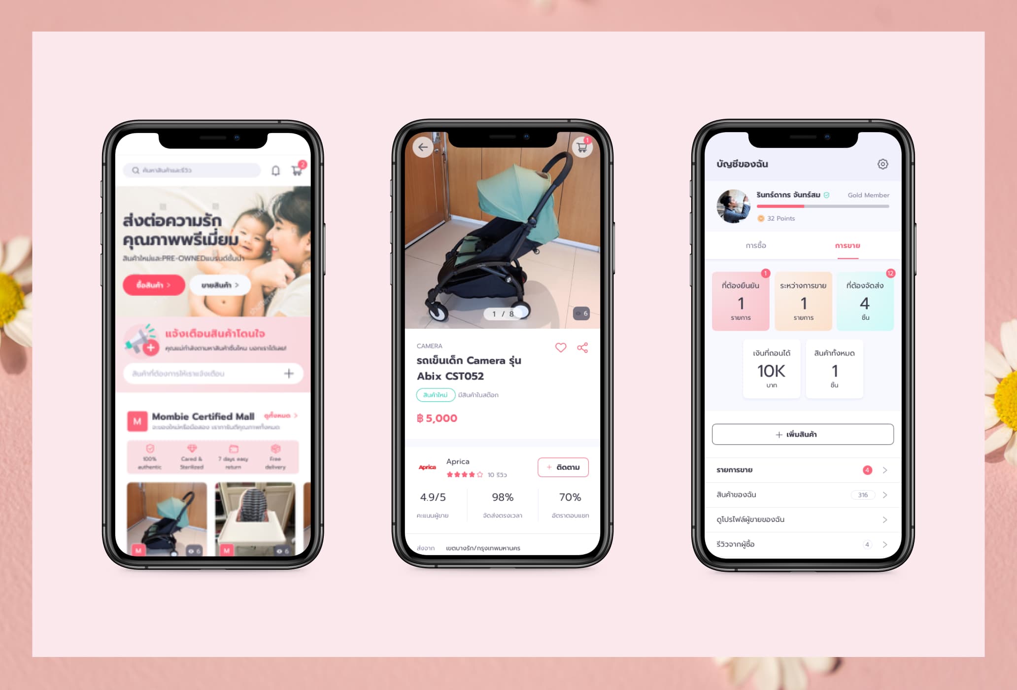
MombieStreet — A marketplace for used mom and baby product
My role
UX/UI designer
My responsibilities
- Wireframe
- Visual design
- Participate user testing
Tools used
- Overflow
- Sketch
- Invision prototype
Project info
- iOS Native application
Visit the application
Overview
MombieStreet is a small startup. They wanted to create a marketplace for mom & baby used products. The founders of the startup are the parent themselves. They found that babies grow very fast. So most of the baby products are getting thrown away in good condition. Plus, famous or high-quality baby products are expensive. So building a marketplace for used baby products will benefit both buyer and seller. The buyer can buy a good product at a reasonable price, while the seller can earn money from their unused products.
The initial goals of the project are;
- Design a clean and functional iOS app
- Focus on sellers/buyers interactions
- Design for MVP (Minimum Viable Product)
Design process
Understand the requirements
Based on functionality requirements, I did the competitor benchmarked and preliminary research to gather ideas.
Wireframe
I quickly create wireframes to visualize the user flow and screen structure.
Validation
With the wireframe prototype, we did user testing for the main functionalities. Afterward, we refined the wireframe based on the testing results.
Visual design
We came up with a UI style and color palette that would attract our target user group.
Wireframe
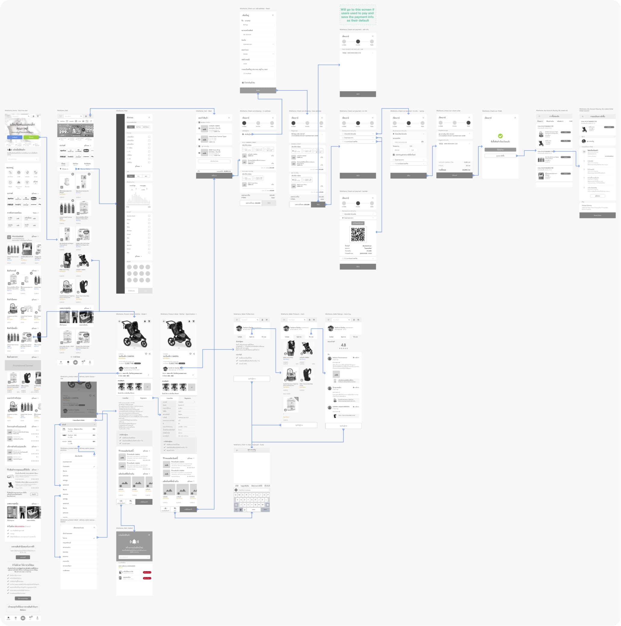
Buying flow
Buying flow is the most important flow in the application. The flow starts from browsing for products, filtering, add to cart, and buy.
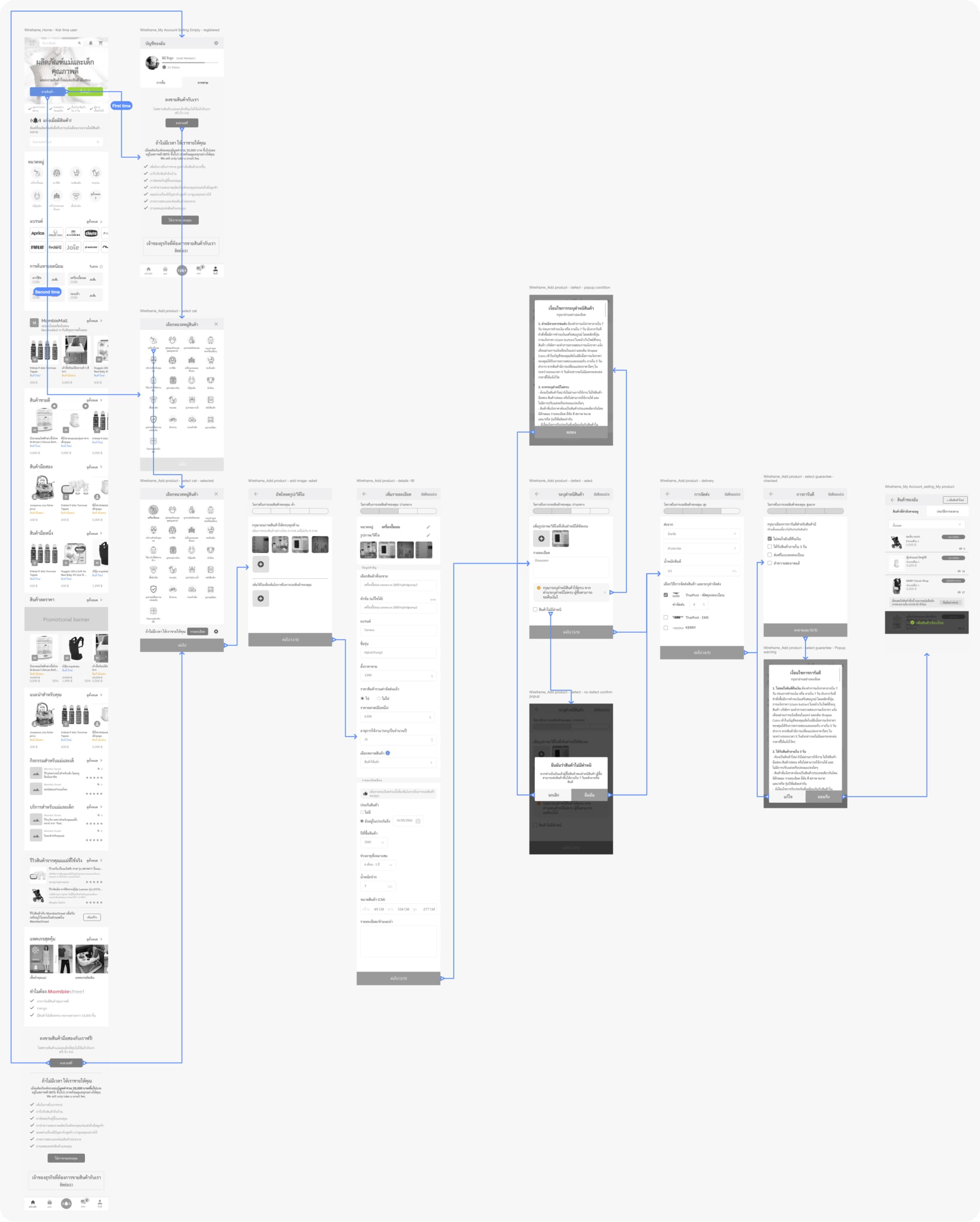
Selling flow
This is the flow where the seller adds their used product to the platform. We break the process down into four steps to make it seems shorter and to let the seller focus on one thing at a time.
Usability testing
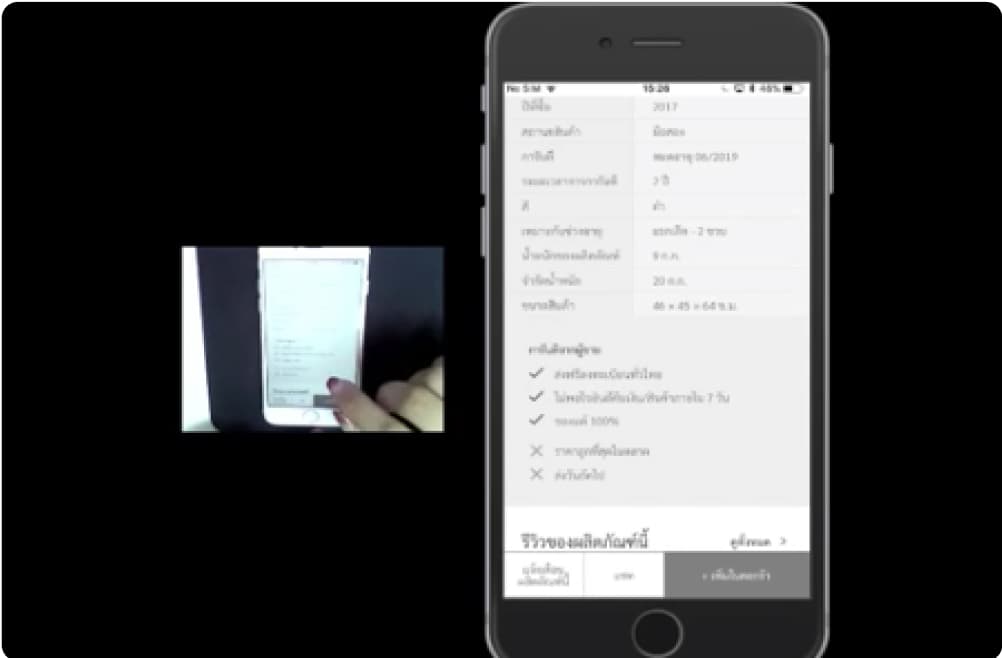
We did usability testing with five participants to validate our design. The testing covers two main flows;
Buyer
- Search/browse for an item
- See product details
- Order the item (Add to cart & checkout)
- Track the order progress
Seller
- Add an item to sell listing
- View selling product
Here are some of our findings and design solutions.
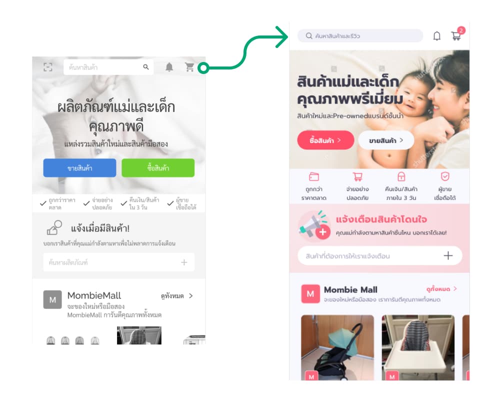
Finding: Users could not or spent time to find the search bar
Solution: Added background on the top navigation bar to improve visibility
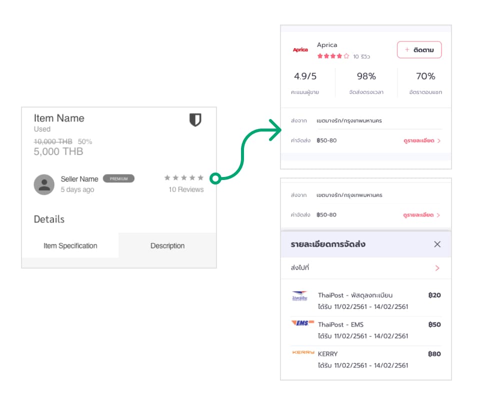
Finding: Most of the users are concern about shipping fees. Even if the product price is affordable, the shipping fee is still an important factor when making a decision.
Solution: Include the shipping fee section on the product details page.
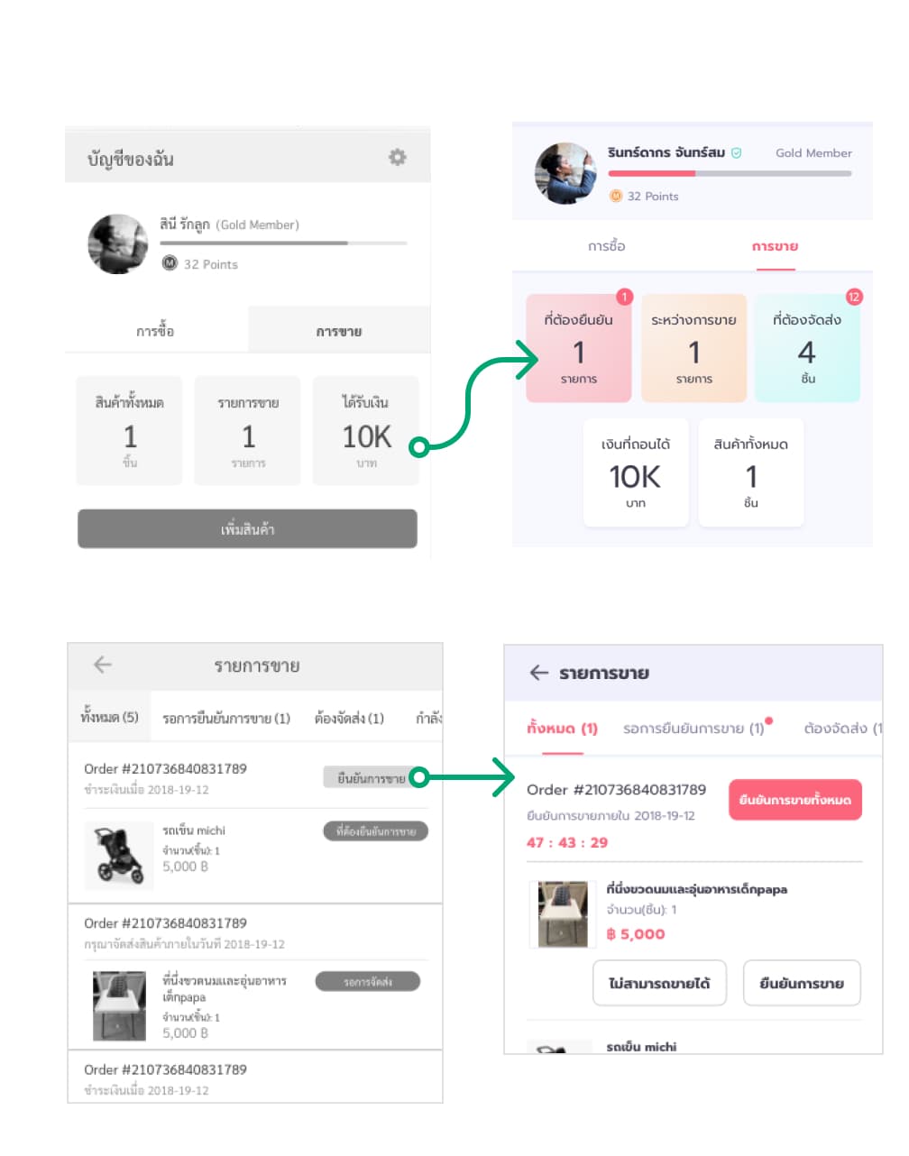
Finding: Sellers don’t aware that they have to confirm selling when user buy their product.
Solution:
- Added notification indicator and use bright color to draw attention.
- Added countdown banner to prompt the action and add more sense of urgency.
Final user interface
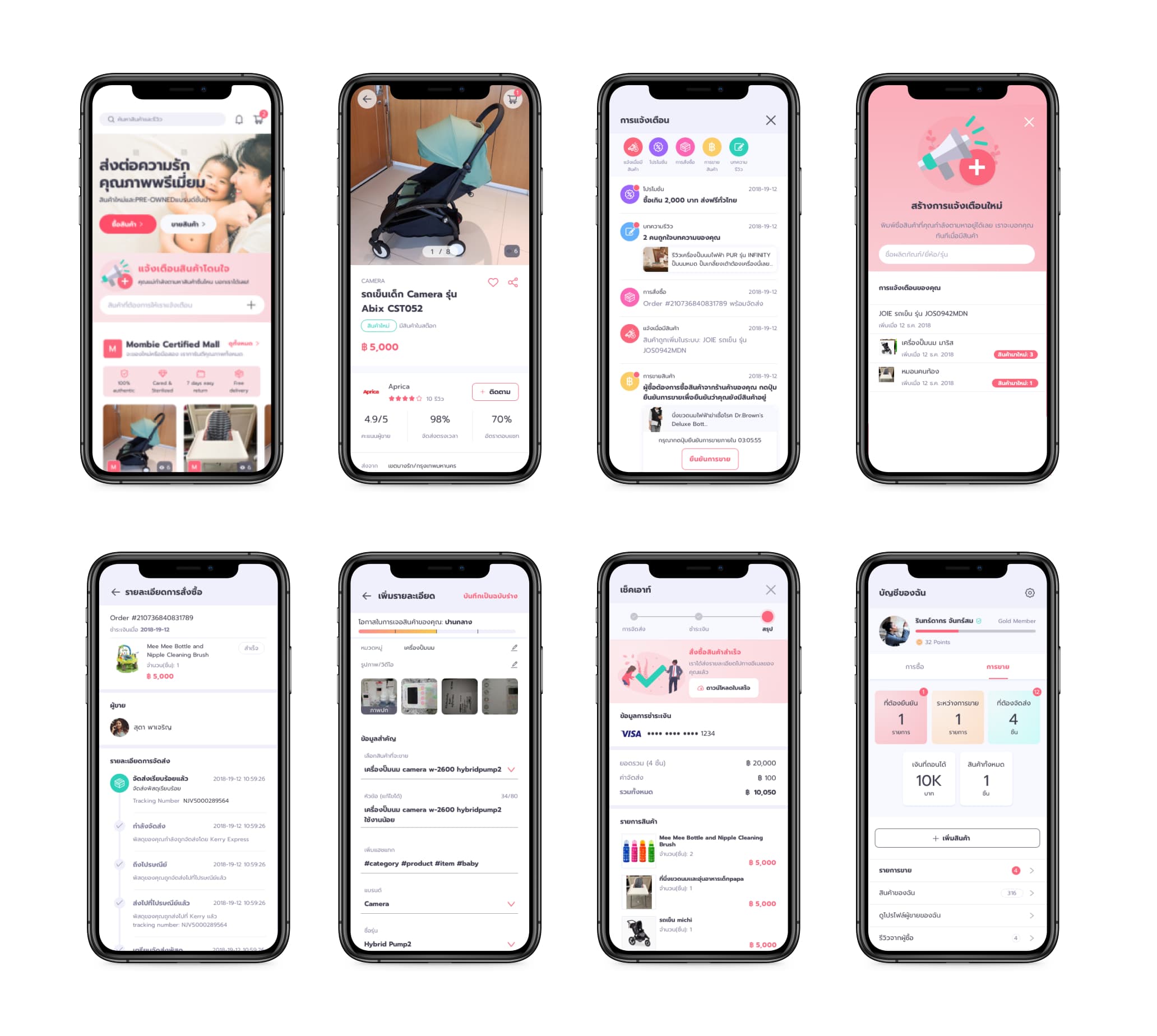
Design system & hand over documentation
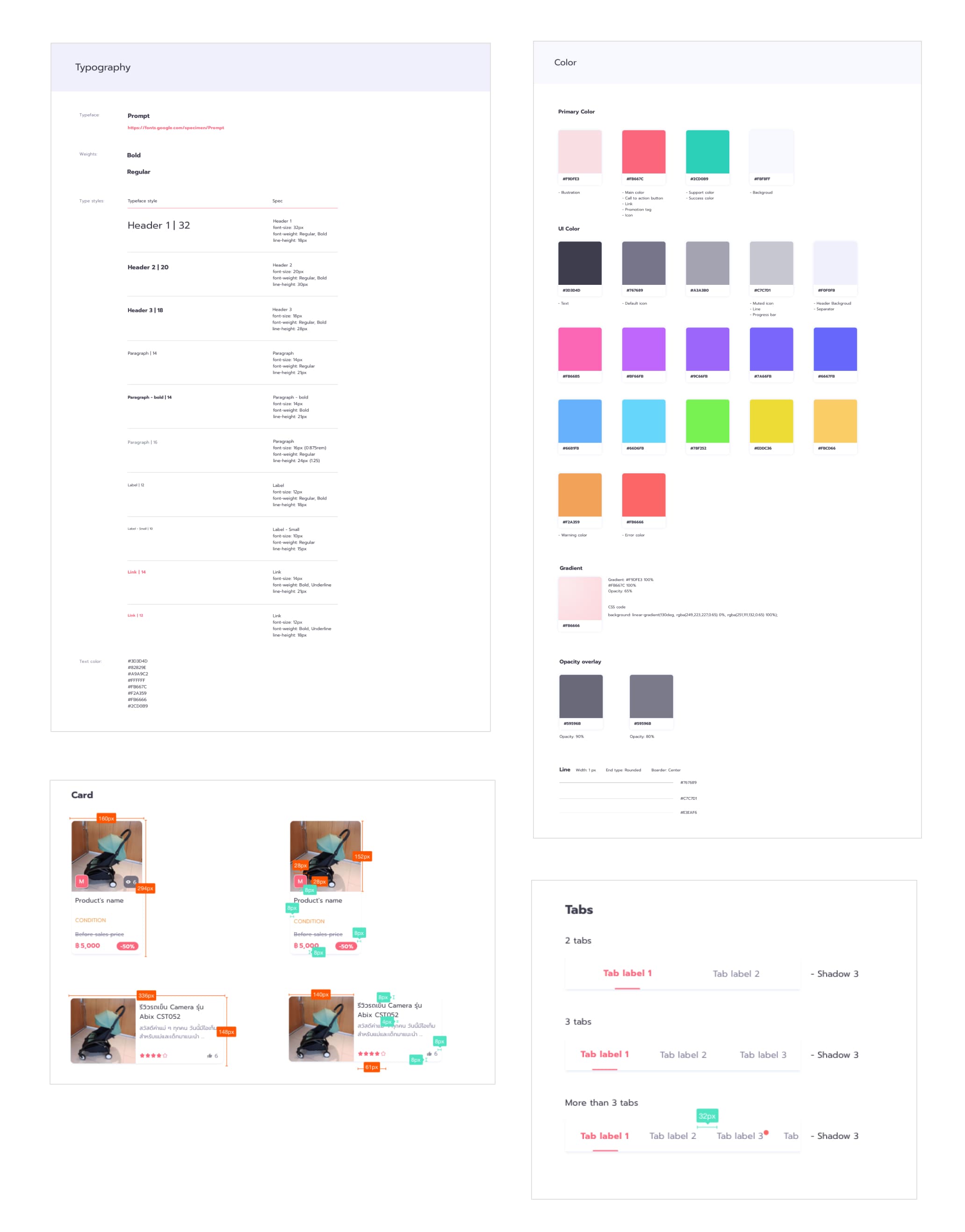
I build an application style guide including usages, design specs, and design variations.
