Establishing an internal design system for a leading bank in Thailand

My role
Design system lead
My responsibilities
- Design UI components
- Create design guideline
- Create design library
- Create design documentation
Tools used
- Sketch
- Miro
- Zeplin
Project info
- Design system for internal usage
Overview
This is an NDA-protected project, so I could not reveal any information about this project. However, I will write about the process of how I came up with a design system for internal usage. The goal is to help centralize design language across the teams.
Challenges
1. The first constraint is time
When I join this project, the teams are about to move into the UI phase and the timeline of each squad has already been set. Since the timeline is tight and we do not have time to create a perfect 100 percent complete design system, I decided to rapidly create an MVP version of it with a common component (like text fields, buttons, typography, etc.) first. We also take a look into the existing wireframe to get a glimpse of which component should be included in our first release. Our plan is, after the first release, we will continue to add more components and design documents.
2. Variety of skill levels
A lot of designers are at junior level and not yet familiar with a design system. To make the system accessible to everyone, I have to refrain from creating complex and customizable components. Documentation is also a key, for each component, I added a section called ‘swappable component’ and put all variations of a component together.
Design process
Design systems benchmark
Learning how other design systems are constructed in terms of organization, component naming, and design guideline.
Design the design system
I start with fundamental components such as typography, color, and button. Then I continue to add more complex components and more guidelines.
Feedback & requirement
After we launched the design system, we collected feedback from the designer. Which helped increase the usability of the system.
Development
To make the design comes to life, we work with the developers to develop the Storybook component library. My task was to clarify the component's usages and review them after the components are coded.
Design system structure
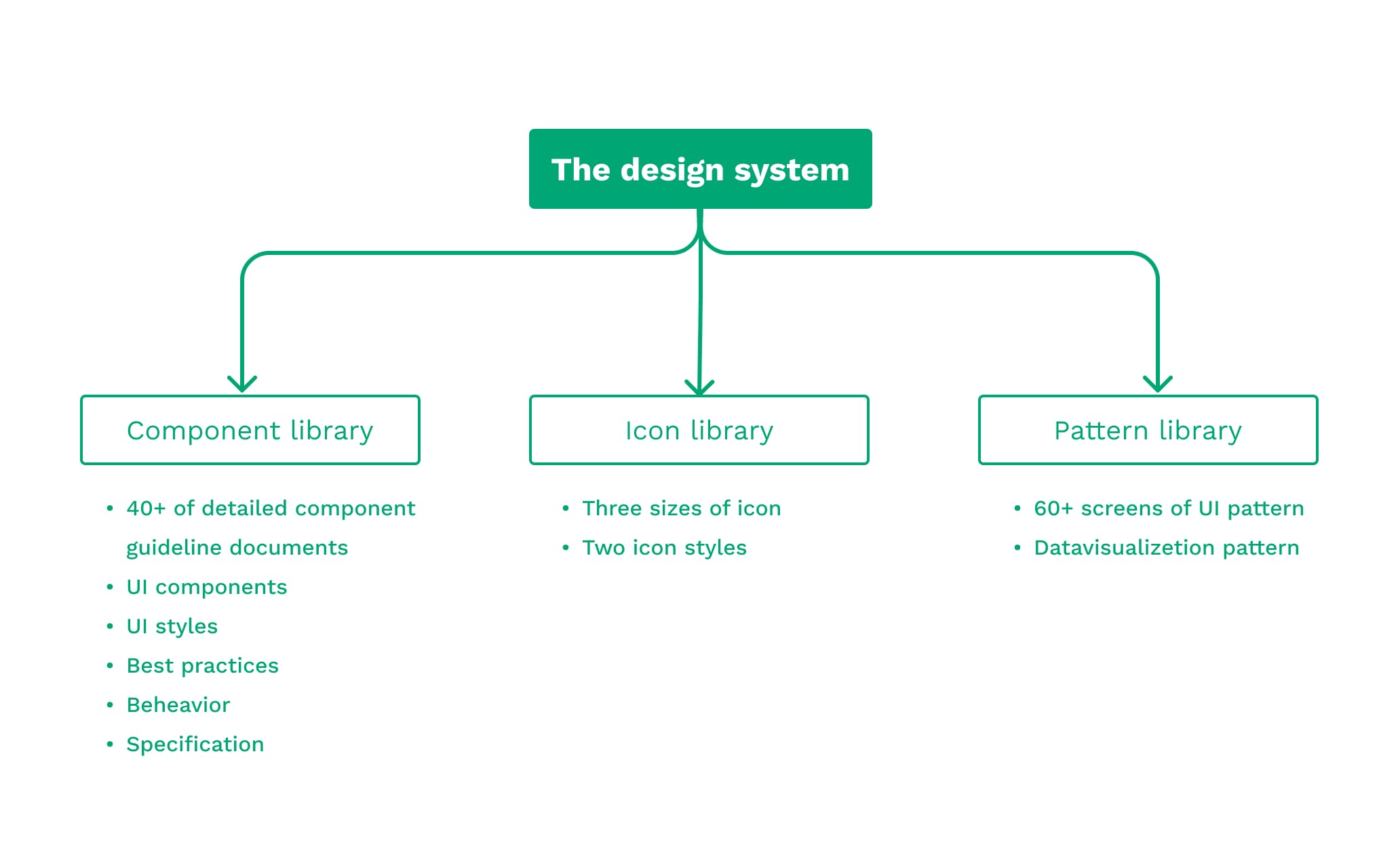
To make the system organize and easy to manage, I split everything into three files.
- Component library: including UI component and guideline.
- Icon library: including icons in all sizes and styles.
- Pattern library: including frequently used screen patterns.

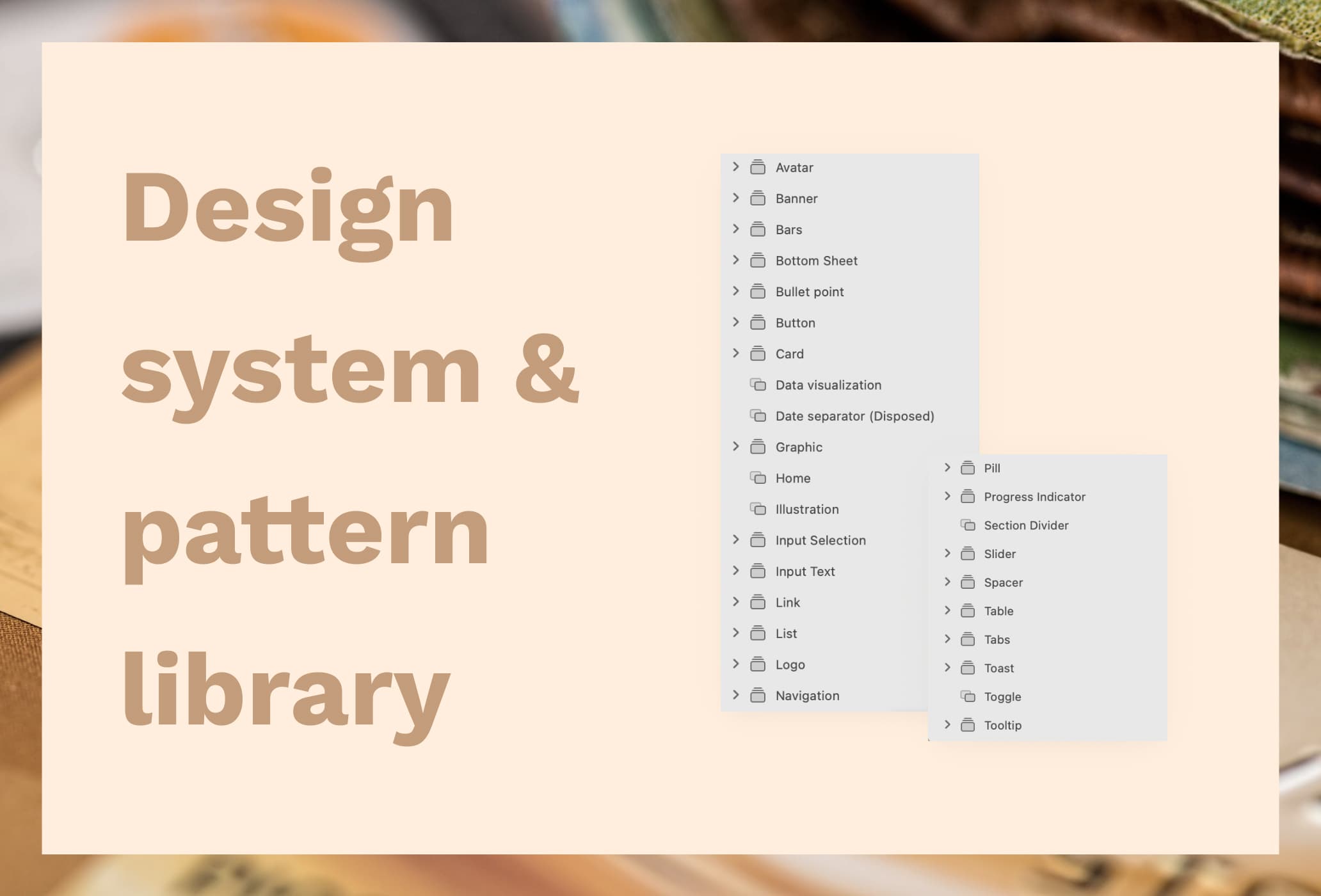
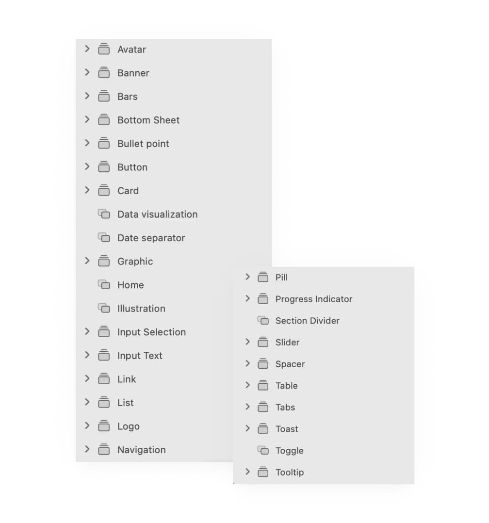
Component library
My priority is creating components that are accessible and easy to use. Here is the list of my component settings
- Meaningful layer naming and arrangement
- Set layout constraint
- Manage overrides
- Make sure all layers linked to color/text styles

Component documentation

Good documentation help put everyone on the same page, keeps the design consistency, and also helps improve design quality. As I mentioned that there are some differences in the level of skill, so it is important to have everything documented in detail. Here is what I include in the document
- Component usages: when to use, when not to use, and best practice
- Component variations: swappable piece, all possible variations, and possible color treatment
- Specification: size, spacing, touch target
- Placement: how to put the component in the design
The result is satisfactory. We improve overall workflow efficiency, not only in the design phase, but we also use the document to hand off the design to the developer.
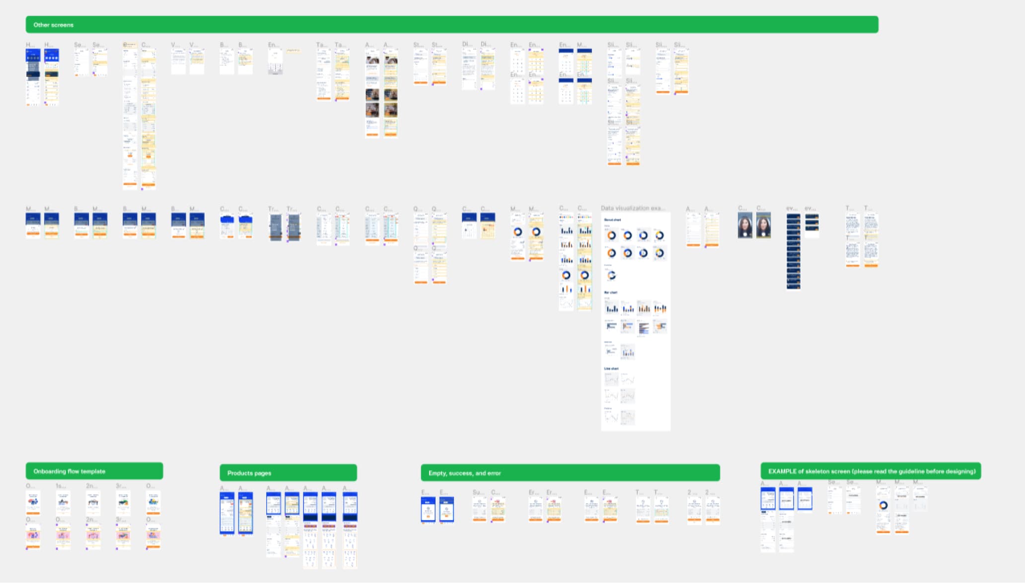
Pattern library
The next step is to put everything in context. In the pattern library, we include the main and other common screens such as Home, Product Details, Onboarding, and Empty State. The team can use this as a reference and source of inspiration. This helps speed up the process, as the designers don’t have to waste their time thinking about the spacing, design structure, or re-create existing screens.
